Jump.ca
retail stores
-
Retail Store and Guest Experience Design
-
Jump.ca
-
Chrysalis.co
Jump.ca stands as a prominent wireless retailer in Saskatchewan, Canada, constantly striving to enhance both customer experience and operational efficiency.
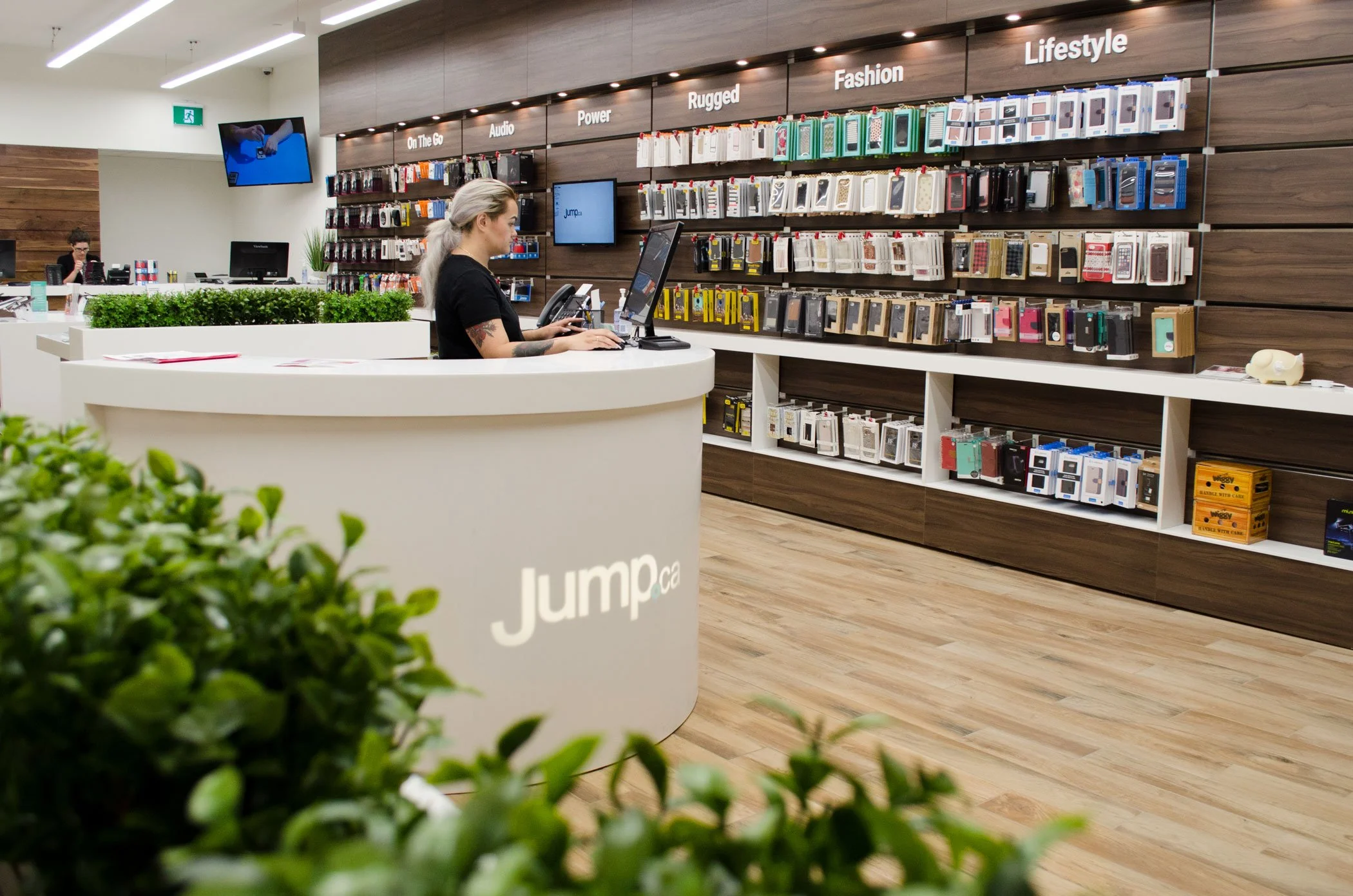
In the previous generation of Jump.ca retail stores, a modern aesthetic was curated within the interior—featuring abundant digital signage, angular fixtures, and contemporary decorative elements. While this design was well-received and aptly reflected the cutting-edge nature of wireless technology, it was noted to convey a somewhat cold ambiance to store visitors. Moreover, as the industry progressed and embraced a broader array of associated products and services, an evolution in store design became imperative to align with these advancements.
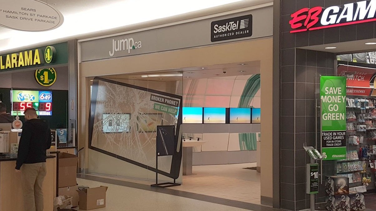
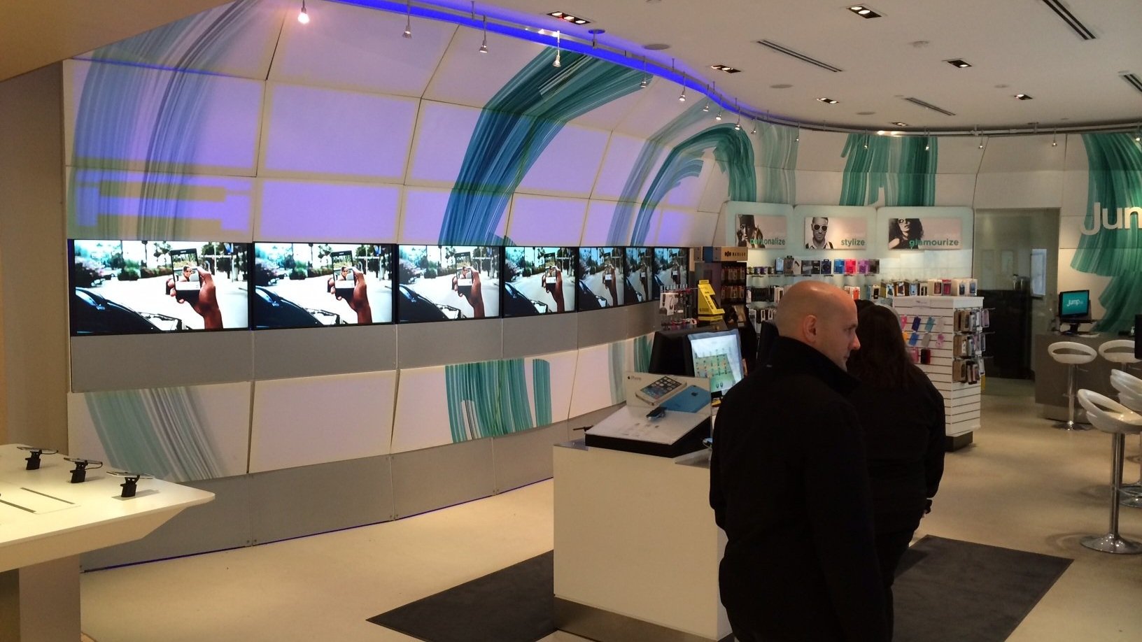
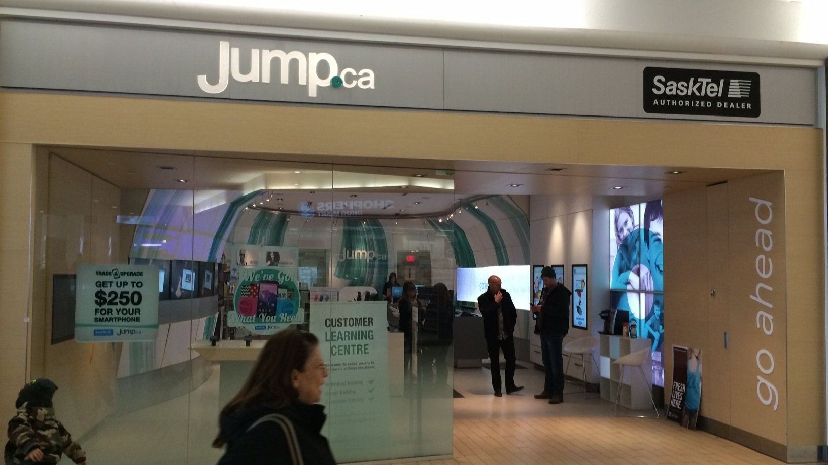
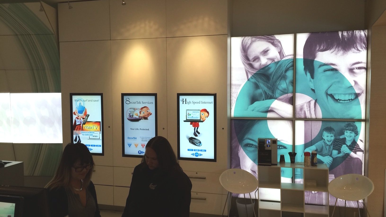
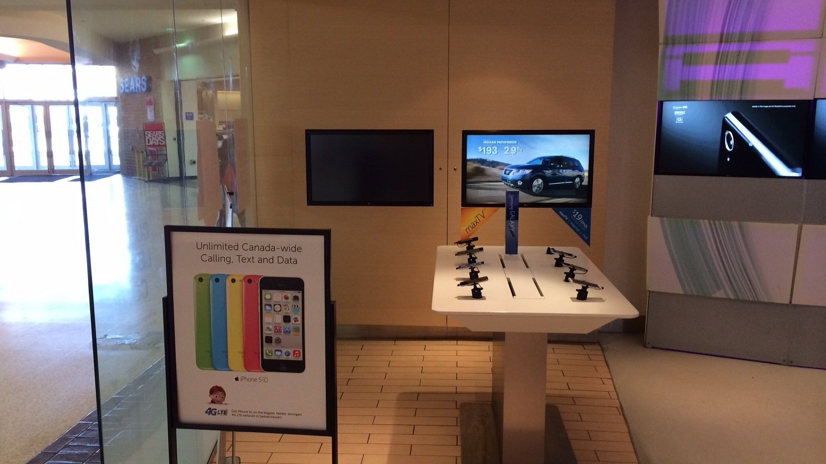
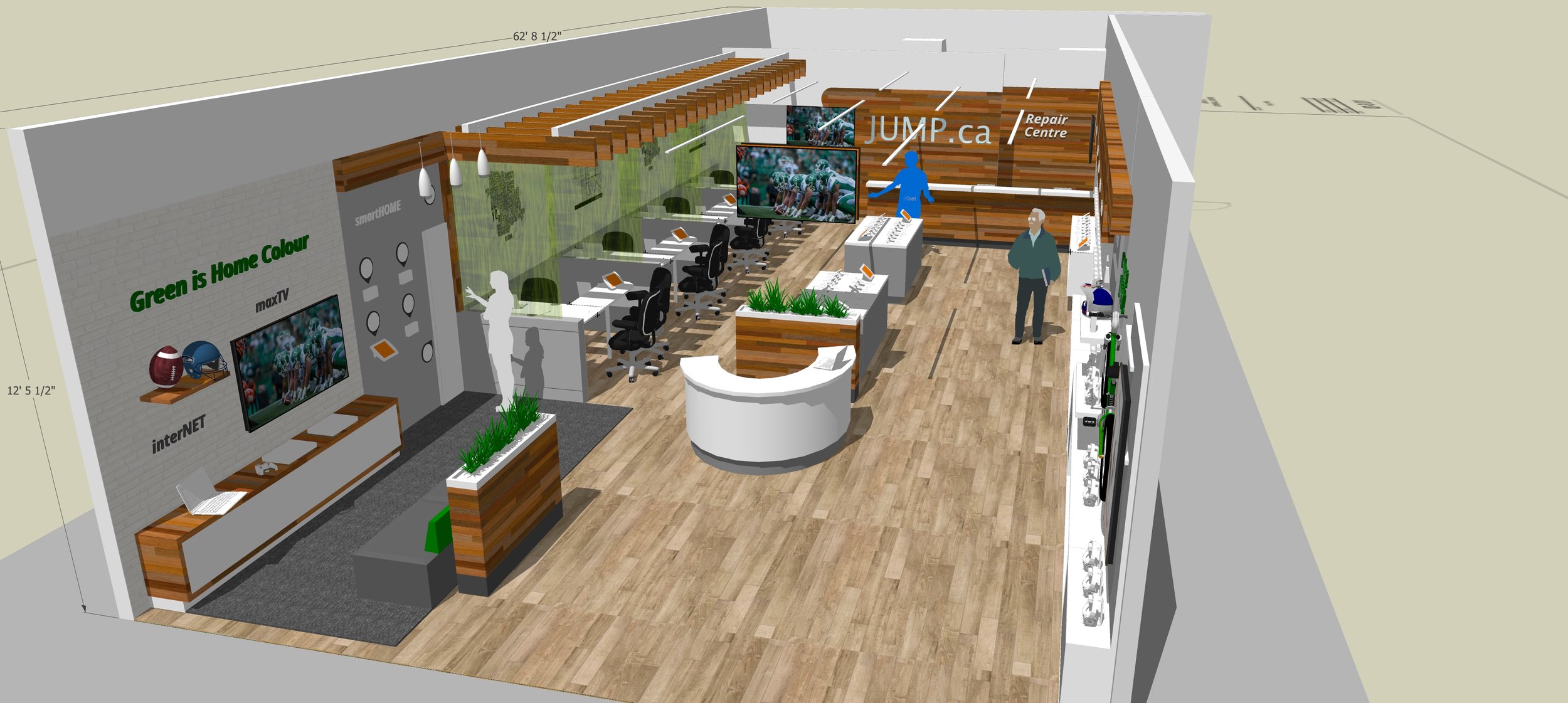
Jump.ca expressed the need for a warmer atmosphere, improved seating areas for extended cell service activations, increased merchandising space, a contextual home product demonstration area, and enhanced facilities for phone repairs.
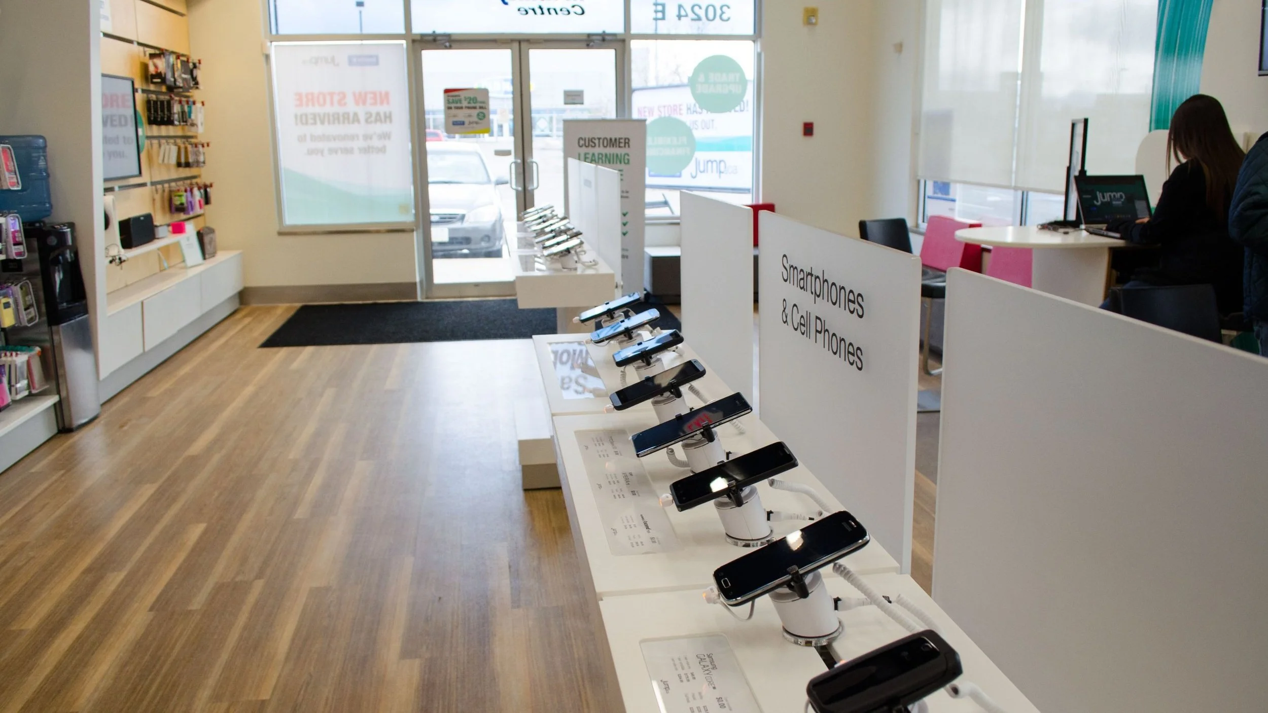
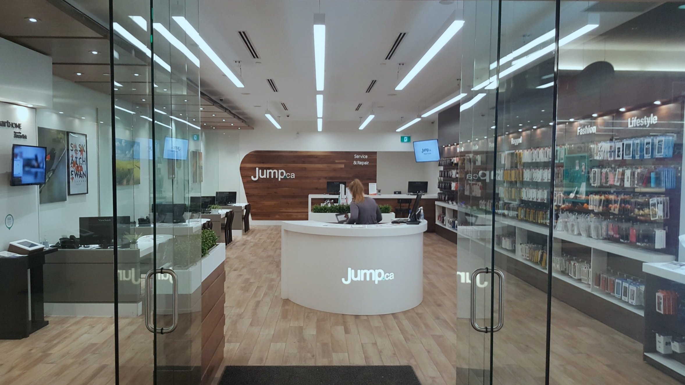
In response, collaborative efforts between myself, Jump.ca executives, and store staff led to proposed designs that retained the recognizable dynamic angles on the feature wall while softening the corners. The group incorporated ample wood textures to infuse warmth into the ambiance and contrasted them with clean white surfaces to effectively showcase the devices. Comfortable consultation stations were introduced to facilitate discussions between staff and customers, offering privacy with partitions.
Additionally, the group maximized the utilization of side walls for organized product displays, including a dedicated section for home products with demo stations. A central horseshoe-shaped greeter station was innovatively integrated to streamline customer flow, also serving as a flexible checkout station during busy periods. Notably, the Repair Centre gained increased visibility as it was prominently displayed on the feature wall, with expanded surface area in the back of the house.
Utilizing SketchUp Pro and VR technology, I rapidly guided the decision makers toward the optimal solution within a matter of days. The conceptual designs were then translated into detailed architectural documentation for the construction.
Following a successful implementation at this location, the elements from the new designs have been replicated across multiple locations throughout Saskatchewan. The positive outcomes observed at this site encouraged the adoption of these design elements, resulting in a consistent and improved customer experience across the region.
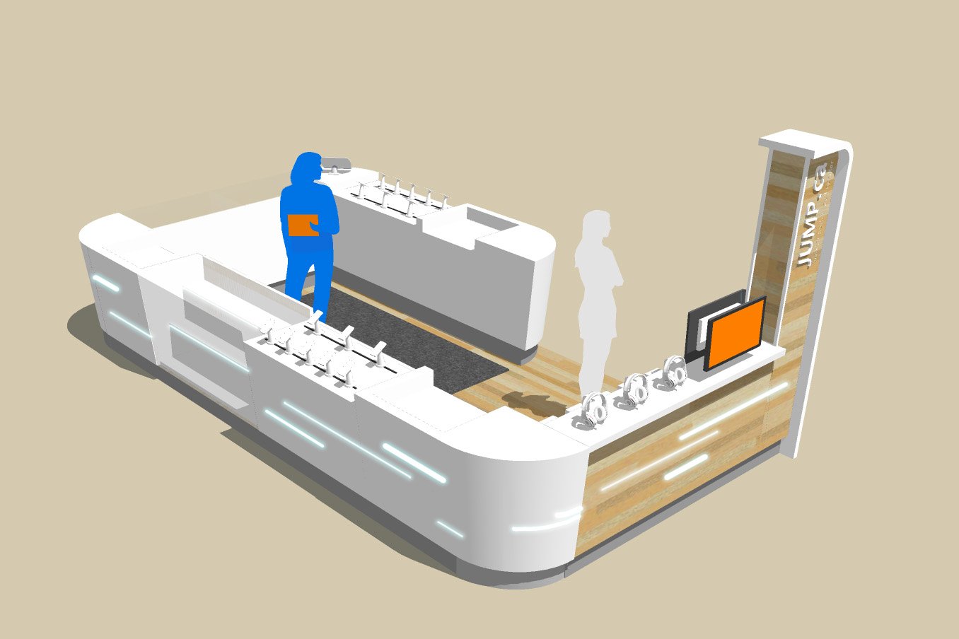
Furthermore, I developed design concepts for mall kiosks, a more compact format that mirrors key elements of the larger stores. This includes the juxtaposition of clean solid surfaces against wood grain accents, a distinctive seating area—uncommon for mall kiosks— and more expansive merchandising cabinets with an equivalent number of POS stations. Notably, they lowered the display area height from bar to counter level, facilitating closer and more engaging interactions between staff and customers.

